in association with
and

presents:
Kaplan Early Learning Company
Brand Refresh
Kaplan Early Learning Company has been a major player in early learning for decades. More than just a provider of home and classroom resources for pre-K through third-grade children and teachers, they’ve used their thought leadership to drive congressional support and standards for early education. Kaplan has long understood that for children in this stage of their lives, learning and play are one and the same, so the company decided that it was time to center their entire philosophy around that developmental truth. And to ensure Kaplan’s brand identity was in sync with their new mission and vision, UpperNinety was enlisted to refresh the entire look of the Kaplan brand in a way that reflected their newly established core values. Our goals were clear: distinguish Kaplan in the early learning category, drive employee pride and engagement and help Kaplan achieve its mission and mission.
Personal attributes of the brand
Before we started anything, we worked to create the personal attributes that would define the brand and shape its new look and feel. Basing our thoughts on the expert strategy work performed by The Dot Collection, we crafted the brand persona that would carry us through to the end.
Lighthearted & Fun
Play and learning are serious, but not for kids, which is why a lighthearted approach can be beneficial to the Kaplan brand. A playful, easy-going look and feel helps the customer live the experience of Kaplan, rather than just observe it.
Thought Leaders
Kaplan is able to confirm what parents and teachers have suspected for years: play is learning. With a calm assuredness in its look and feel, Kaplan can showcase its thought leadership in this arena, ensuring customers that they’re partnering with a company that understands early childhood education.
Confident
Kaplan has an edge on other companies because the science proves what they’ve been touting all along: that play and learning are inseparably linked. This enables Kaplan to speak with authority through words, visual elements and photography. And through their measured confidence, their customers will gain their own confidence in the company.
Reassuring
Parents and teachers want the best for their kids, and Kaplan can use its deep knowledge of the relationship between work and play to inject a sense of calm and assurance into its creative executions. This feeling will resonated amongst its customers.
A new visual identity
Kaplan’s new look was going to be a sizable departure from what they had been doing, but it still had to scream “Kaplan” when people saw it. So, we put together four unique design possibilities, each that brought out the determined personality attributes in ways that made them shine. While we would have been happy to hang our hats on any of the options, the chosen look is exactly what we’d hoped for. It’s bold. Clean. Colorful. And it smartly demonstrates Kaplan’s core belief without hitting customers over the head with it.
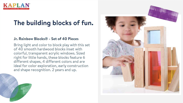
We created a colorful library of childlike shapes to enhance the look of every execution, and, when paired with bright, natural photography, it creates an educational world with a smart, lived-in quality.
Fun, playful shapes that evoke childlike learning.
Combined with photography, you get a standout look unlike any competitor.
A playful-yet-serious typeface
To accompany the visual look we put together, it was imperative that we used a typeface that worked hard to accomplish a variety of goals. It had to have an overall professional appeal while still evoking childlike wonder, it had to be low cost, and it had to be web friendly. This is why we landed on Brandon: a pleasing, respectable sans serif with a touch of childlike flair occasionally popping up throughout its characters.
Mostly professional, with a touch of fun about the J, T and R.
Don’t touch the logo. Except, we totally did.
Kaplan’s bright, colorful logo is known throughout the world of education, and they didn’t want it changed. And we respected that wish … kind of. We didn’t change it, but we did suggest altering it. We gave it a more modern appeal without forcing Kaplan to redo all of their existing physical assets at great cost. Instead, they have a new logo that can be slowly introduced throughout their business as needed. And the change we asked not to make is now atop the Kaplan website.
So we started here:
And we took it here:
SO, LET’S PUT IT ALL TOGETHER.
With a direction chosen, it was time to prove that it would work across a variety of executions.
Here’s how it all turned out.
Main Catalog
This is the main driving element for Kaplan customers, and its playful, informative look reflects the new mission and vision page after page.


Specialty Catalog
Specialty catalogs will still feel unique from the main catalog while not stepping away from the new
brand identity.


Print & Promotional Flyers
Print materials will walk the line between learning and play.


Discount Cards
We’ll use discount cards to further the Kaplan vision.


Conference Booth
Bright colors and bold messaging will separate Kaplan from the competition at conferences and trade shows.

Digital Ads
Playful ads will dominate the digital landscape.


Web Pages
The Kaplan web experience now helps customers understand the learning = play mindset.


Emails
Every email supports the mission through copy and design.


PowerPoint
For internal and external communications, the Kaplan deck now represents their mission.


the importance of employee acceptance
We’ve all been part of a shift in a company’s mission at some point in our lives. And that means a lot of us have seen the fallout. You get a big meeting announcing the change, then a bunch of stuff shows up on the wall. But you don’t feel the change. It feels like the change is around you, but doesn’t include you. The problem is not knowing how you fit in. So we wanted to do more. While we definitely are changing the office space, we’ve also put together executions that show Kaplan staff — on an individual level — that every team member is integral to the mission, from the folks in the warehouse to leadership.
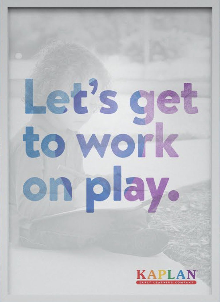
Interior Executions
Each serves as a reminder of how play is important for Kaplan team members.


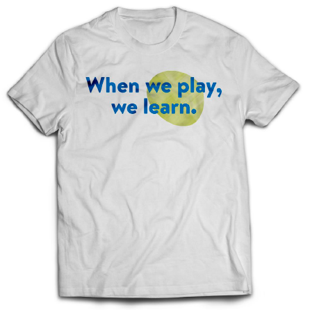
Role-Specific Shirts
These shirts show staff in different roles at Kaplan how their job is integral to the new mission. Here’s a few examples.